Call to Actions and How They Help You Get Clicks
Websites use a variety of Call to Actions (CTAs) to prompt users towards performing tasks. CTAs are interactive. You can find them presented in the form of hyperlinks or buttons. They are designed to stand out from the layout of your website or newsletter.
Furthermore, they’re paired with other web design strategies can increase your conversion. For example, CTAs are commonly seen working hand in hand with your content. You’ll often see blogs posting related articles to the current topic with CTAs that say “Read More” to show you things that might catch your interest.
With that, continue reading to see our list of 10 common CTAs and how they can help you get clicks:
1. Add to Cart
When users see this Call to Action on e-commerce websites, they know exactly what to do. There’s no need to analyze the statement further in search for any hidden meanings. Plus, you are reminding them of their current activity (online shopping) and giving them steps necessary to accomplish a goal (buying a product).
2. Add to Wishlist
On the other hand, some users are simply browsing your product pages and may not have the intent on purchasing anything as of the moment. Offer this CTA as an alternative to adding products directly to their cart. This way, they can make an account and you can identify which customers are thinking about purchasing certain products.
3. Learn More
Place these at the end of a brief preview of your article or product description to ease viewers towards more in-depth descriptions of the products you offer. Additionally, your Social Media Agency can use this Call to Action on your social media accounts.
4. Join, Sign Up, Create an Account, Subscribe
Place Call to Actions beside or below forms placed on pop-up dialog boxes upon visiting a web page. For example, make your CTAs appear as requirements. You can present these Call to Actions to before users before redirecting them to a service’s trial version, a product’s demo, or an online course’s first few episodes.
5. Discover, Explore
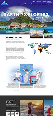
More commonly found on landing pages, these CTAs are more subtle, promoting a sense of adventure. Nonetheless, these work well for travel agencies that aim to advertise tourist destinations or geographical locations along with their service.
6. Download Now, Offer Ends Today
Including “now” in your Call to Action directly informs visitors that whatever you’ve offered will be delivered to them instantaneously. It assures them that their clicks will lead to something worthwhile. Similarly, words that relate to time inform users that the product is only available during specific occasions like holidays.
7. Limited, While Supplies Last
This strategy gives off a sense of urgency and scarcity. It shows that your products are in demand and may be on the verge of being sold out. Its effectivity comes from the customers’ fear of missing out on something of value. These CTAs also use loss aversion, a cognitive psychology and decision theory that’s also used in marketing. It explains why people would rather avoid losing something than gaining something of similar value.
8. Get The Trial Version For Free
Just like how food samples are presented in physical stores, you can also offer a sample of your product or service online. For example, by providing samples, you’re proving to your customers that you’re confident that your service can address their needs. Plus, you’re making it clear that you want them to experience the benefits first before requiring them to pay. You can even simply gain their trust by offering knowledge that complements your services like checklists, toolkits, templates, or cheat sheets.
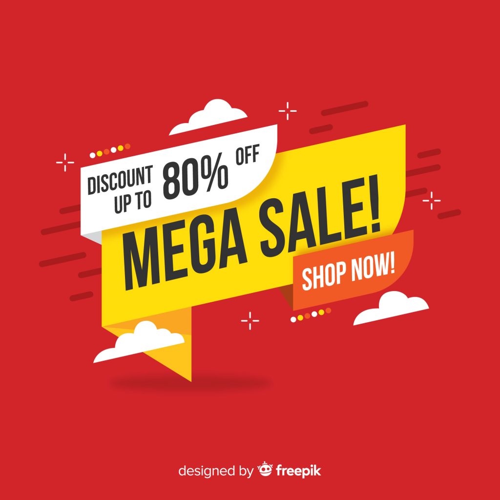
9. 80% Off
Sometimes, discounts, flash sales, and other special offers are all you’ll need to catch your audience’s attention. For instance, you can present this as a gift to your customers who have followed certain brands or purchased products for the first time. Keep in mind that big numbers and great discounts can easily appeal to a lot of people.
10. Yes, ___
Finally, you can also write your Call to Actions as answers to your questions. A simple affirmative phrase like “Yes” paired with a brief statement highlighting a specific benefit can do the trick. Moreover, when your viewers read “Yes”, they become more compelled to perform the action. And while it may seem counterproductive to provide a “No” button beside it, it’s not. Presenting them with the option to choose “No” after they’ve landed on your web page will only make the users reevaluate the purpose of their visit. They may just come back and click “Yes” the next time.
What’s Your Call To Action?
In short, CTAs help your company’s digital presence grow. They give you the opportunity to guide your customers towards achieving a common goal. Write them wisely and place them in areas of interest on your website to maximize their reach. Do you have any Call to Actions that you think should be on this list? Let us know!









Comment 0