Telehealth Website Design: Best Principles to Consider
Websites for clinics or medical institutions can represent you to interested patients. So, it’s vital to learn about Website Design principles for Healthcare Sites, including those of Telehealth and Telemedicine. The great thing about website creation today is that some site builders provide editable templates for Telehealth providers!
Though you might have the ideas for Telehealth or Telemedicine Website Design, you might not have the skill to do so. However, you’re in luck, as you can find the best possible Web Developer for your budget. Otherwise, you can use website builder tools with visual drag-and-drop editors. For instance, WordPress has excellent Lightweight Themes you can build on!
However, with Medical Website Design principles, you can create a Healthcare Site that’s:
- visible on results pages;
- showcases the nature of your clinic; and
- provides critical information to website visitors.
Telehealth: The Modern Answer to Healthcare
Telehealth is a subset of eHealth that uses things like wireless communications and the internet for long-distance healthcare. In addition to healthcare, it’s also helpful for educating patients and assisting public health administration.
Telehealth and Telemedicine are part of the Healthcare Industry. The terms seem similar, but they refer to different things. Telemedicine refers specifically to remote health services. Telehealth encompasses health services as well as healthcare provider training, medical education, and meetings between administrators.
You want your Telehealth Website to be attractively designed. So, it must embody the same principles as your medical clinic. Thus, it should communicate the nature of your clinic’s expertise.
Not only is your Telehealth Site critical for patients to reach you, but it also serves as a resource. This way, your site can establish your practice in their eyes. You can even post updates, streamline medical billings, and more with the right Dev.
Best Web Design Practices for Telehealth Sites
There are a few essential factors concerning Web Design for Telehealth providers. But in general, your Telehealth Site must be:
- accessible to all visitors across devices;
- easily navigable; and
- informative about your clinic.
Consider Using a Content Management System.
Content Management Systems can help seasoned Devs, and business owners craft a stunning, functional website. Many offer tools that make the Website Development process more manageable, regardless of skill level. Thus, a CMS helps you create web pages or add a blog to your site. In addition, if your clinic has Social Media accounts, you may connect them to your Telehealth Website.
Also, it’s become necessary to use Search Engine Optimization practices to help your website become more visible to interested searchers. Fortunately, plenty of SEO-friendly CMS can help you rank high on search results pages.
Some CMS can help you build a Healthcare-based Website, but it is vital to choose wisely. Each has its quirks, capabilities, pros, and cons — some even offer dedicated Telehealth Website Templates! So while many are suited for the needs of varied industries, not all are fine-tuned for Telehealth Sites.
Remember to Create a Mobile-Friendly Site.
Part of Web Design is considering how your intended audience will access the website. For instance, most Internet users favor mobile devices for browsing. Almost 59% of mobile devices are responsible for web traffic in this day and age.
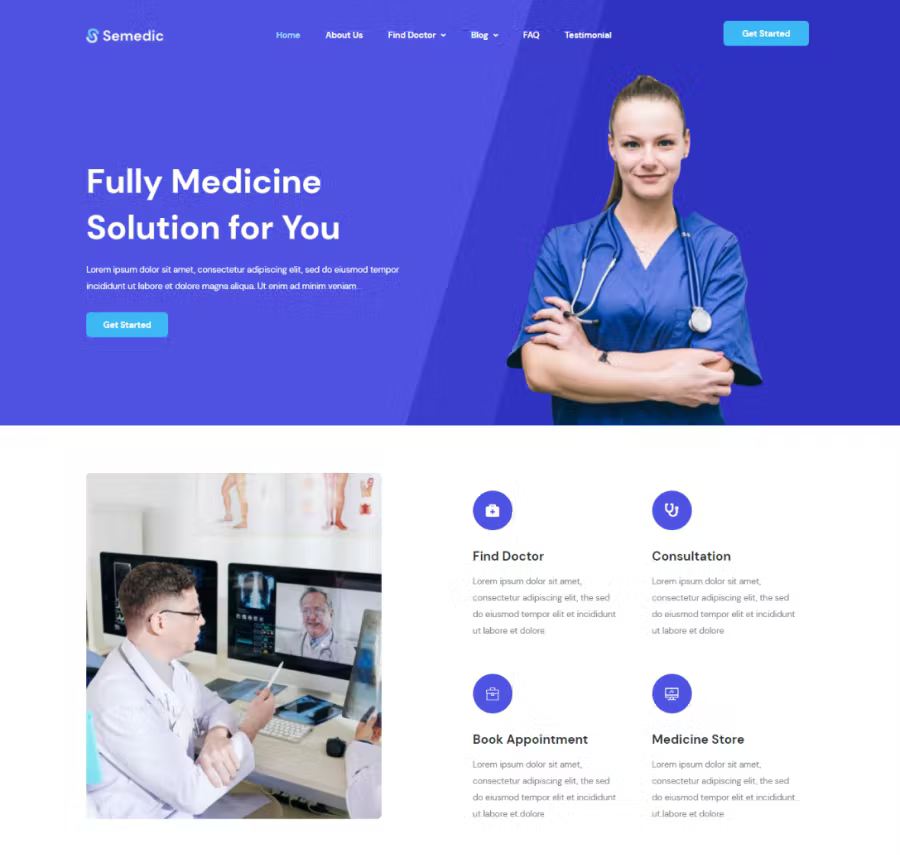
Thus, medical professionals should look into creating Mobile-Friendly Websites with adaptive, responsive designs. This way, regardless of the screen size of their devices, visitors can easily and conveniently interact with your website.
Source: ThemeWagon.
So, because of your Mobile-Friendly design, visitors will have a positive User Experience. As a result, you’ll have a better chance of retaining visitors. In addition, you’ll have:
- lower Bounce Rates;
- higher Conversion Rates and Click-Through Rates; and
- overall, higher rankings on the appropriate SERPs.
Here are a couple of Mobile-Friendliness tips you can apply:
- Optimize the Telehealth Site’s homepage for mobile devices.
- For navigation, use a hamburger menu or a collapsible dropdown menu.
- Let visitors call you with a click!
- Use a CMS that allows automatic mobile responsiveness.
Ensure that Your Website is Interactive
Naturally, a Telehealth Website must be interactive to engage your site visitors. Naturally, a website’s goals are decided before its creation. These goals tend to include gaining more patients or sharing eHealth information. If your website is interactive on top of all that, then you’ll amplify those goals.
To bring in site traffic, you can:
- Utilize Interactive Forms. This lets patients fill out their medical information for submission to the site. It’s perfect for informing the clinic about health conditions, for instance. Also, it’s best to keep the Website Design Mobile-friendly for your Healthcare Organization Website’s forms.
- Apply Call-To-Actions or CTA Buttons. The placement of your CTAs can help site visitors with desired actions such as scheduling appointments, getting prescriptions, etc.
- Create a Secure Patient Portal. You can give patients a safe place to input and save their data on your Telehealth or Telemedicine Site. Patient portals are perfect for updating patient contact details and making appointments.
Add Informative Yet Understandable Content
Many healthcare practitioners tend to use jargon when explaining concepts to patients. So, your Telehealth Website should have site content or copy that the average patient can understand. You can apply understandable medical information throughout the site via Telemedicine or Telehealth Website Design. But, it’s best exemplified in a Q&A section via your Telehealth Website Template.
Regarding blogs, you need to get behind Long-form Content or content with a thousand or more words. Thus, your Healthcare Website needs to be designed to provide longer content that contains critical information about the topic.
Your informative Long-form Content can help search engines too. As people become more aware of your site’s valuable content, you gain more loyal readers and patients. Thus, your website gains authority, resulting in better search results rankings.
Ensure that the Site is Navigable
A navigable Healthcare Website is an excellent User Experience (UX) draw. Visitors will find it less tempting to leave your website if they can quickly find what they’re looking for. So, your Telemedicine and Telehealth Website Design should be intuitive.
Generally, 94% of consumers want a website that’s easy to navigate. Thus, you must create a precise navigation bar or menu that can help direct visitors to where they need to go. Also, remember to apply a hierarchical structure, categories for essential pages, etc.!
Source: Envato Elements.
A search bar is fundamental to ensure visitors can navigate your site. Search bar key features include:
- Noticeable on the site navigation bar;
- Provides filters and sort functions to narrow down search results; and
- Displays results’ meta descriptions (which contain the desired search term).
Optional functionalities include:
- Has an autocomplete function that suggests search terms as you type;
- Offers categories for search results, especially if the website has many pages;
- Has a Breadcrumb Trail; and
- Highlights the search terms in the results.
Use Eye-catching Visuals for Your Telehealth Website
It’s important to use visuals together with text in Healthcare Web Design. This includes pictures, vectors, animation, and even videos throughout the overall layout.
So, your Healthcare Website Design should be visually balanced. Thus, it becomes appealing for visitors to look at and read through. Fortunately, plenty of Telehealth Website Templates incorporate visual elements into the layout!
So even if health information is complicated, you can still find ways to make it understandable for patients. Here’s how to keep your site visually attractive:
- Use high-quality images and videos.
- Apply your clinic’s branding, but with a limited color palette.
- Apply reliable grid designs in the layout.
- Add visual media generously, but not so much that it slows down the website.
- You can create carousels to show off a collection of images.
- Rely on white space to keep things from getting cluttered or cramped.
- Consider utilizing little page animations or microinteractions to add a splash of dynamism.
- Keep blog posts exciting by adding images throughout the text.
Speed Up Your Healthcare Website
People need responsive, speedy sites, especially when it comes to Telehealth or Telemedicine Website Design. One essential way to speed up your site is to crop or compress images to keep them manageable.
You can also lessen your redirects, such as 301s. An abundance of redirect chains can slow down your load speed. Too many of these will negatively affect your overall loading time. Therefore, it’s essential to simplify or reduce the redirects you have at a time.
Also, you can minify your code or remove unnecessary characters or comments. Other things you can take out include spaces, commas, and unused code. As a result, this lessens how many elements load on the page.
Incorporate Web Accessibility Guidelines
It’s critical to follow Website Accessibility Guidelines such as the Americans With Disabilities Act in Healthcare Website Design. Initially, the ADA was mainly concerned with the accessibility of public areas, buildings, and transportation for disabled citizens. But, in 2010, the ADA included regulations for website accessibility.
People with vision or motor impairments might find your Healthcare Website hard to look at or scroll through. Thus, you must apply Telehealth Website Templates or Web Design that comply with Accessibility Guidelines. A dedicated Healthcare Website Developer can assist you with Website Design.
Regulations like the Web Content Accessibility Guidelines can significantly benefit overall design and site visitor UX. Thus, regardless of ability, every person can absorb the information on your website. For example, using high-contrast colors and large text in your layout is best. Additionally, you can apply alt text for images and links on your Health Website.
Consider Patient Data Security
Healthcare data is sensitive, and thus you must respect Data Privacy Regulations. Your Site Design should include security on top of color palettes, font sizes, and text. After all, patients and medical practitioners will input medical and financial data into the site for later use.
To ensure a smooth website experience, you can provide secure patient resources such as appointments or prescription refills. In addition to protecting patient data behind passwords, you can further security with various Web Security Measures. It’s best to choose a CMS that can provide secure patient portals.
Here are additional measures you can use:
- Medical practitioners and patient users should be encouraged to change passwords regularly.
- Block or keep out bots.
- Use secure and trustworthy payment methods if your site accepts paid transactions.
- Inform your medical staff of Data Protection Regulations regularly.
Don’t Forget Your Contact Details!
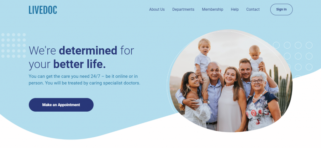
Your Healthcare Website needs to include your contact details, and a Telehealth Website Template can make room for them. So, your contact information should be prominent on the website. Then, people can make appointments quickly, besides pressing a button to call the clinic.
Here’s some critical contact information you can add to your website:
- Your telephone or cellphone numbers;
- Email address;
- Office address(es), if you have a physical location;
- An online calendar that indicates when the doctor’s free for appointments; and
- Instructions for scheduling appointments.
Of course, it’s critical to update your contacts regularly, or at least whenever there’s a change. In addition, you must ensure that the new contacts show up on the website if you change numbers, email, or locations.
Provide Patient Testimonials
A critical Telehealth or Telemedicine Website Design consideration is Patient Testimonials or Reviews. Many look to reviews to see if a product or service is trustworthy. For instance, 59% of consumers say that “physician rating sites are ‘somewhat’ or ‘very’ important.”
So if your medical institution, clinic, or hospital website has excellent reviews, you can incorporate them into your Healthcare Website Design. Thus, you should have a section on the main page that helps potential patients see how beneficial your clinic is. A Telehealth Website Template can help you display a reviews section!
Create Accessible and Functional Medical Web Designs Today!
Since your Healthcare Site is a digital frontend for patients, you need to put thought into Website Design. In addition, medical practitioners tend to provide different services. Thus, every element — layout, text and images, colors, buttons, etc. — should tell site visitors about your clinic. After all, it’s their resource for medical queries and updates.
Not only that, but it’s where you can specify your healthcare offerings and how you serve patients. Also, with the help of a Web Developer, you can allow patients to schedule appointments or order medical prescriptions. So count on Web Design and Development in the Philippines to help you create the perfect Telehealth or Telemedicine Website!







Comment 0