
10 CSS Tricks and Tips to Create Astounding Websites
Front-end and web developers use Cascading Style Sheets (CSS) to define how HTML elements should display on websites. In addition, through CSS, we can apply animations and other effects to make our applications and websites more interactive and engaging. Thus, here are CSS tricks and tips that can help you create astounding websites!
CSS Tricks to Create Astounding Websites
ONE: Vertical Align Through Flex Property
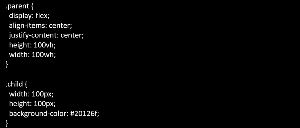
Today, you can already position and align CSS elements easily. You can do this through the Flexible Box Layout Model‘s sub-property called “flex.” Below is a sample code that shows how “flex” works to perform vertical positioning:
Therefore, as you can see, the code above ensures that the child element stays in the parent element’s center.
TWO: Try Out Blend Modes
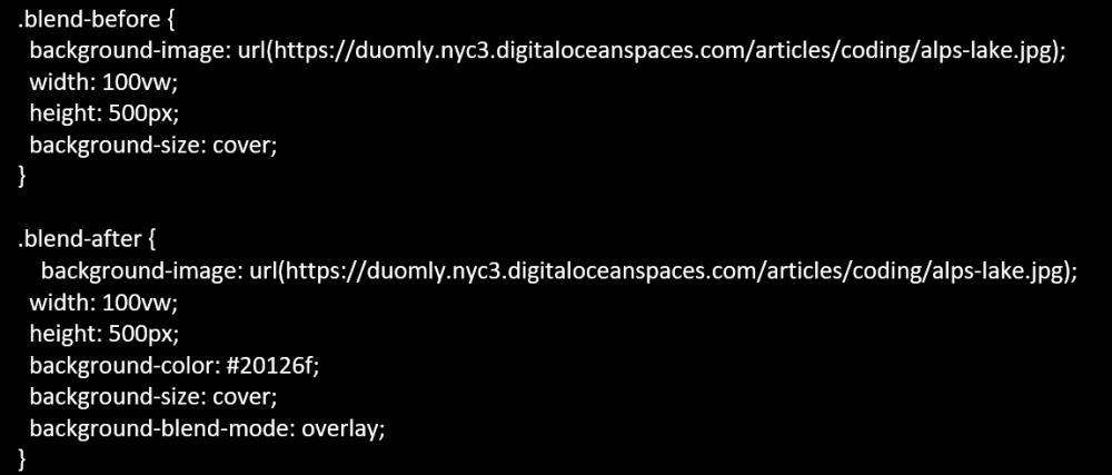
Second, for blend modes, you can either go with the mix-blend-mode property or the background-blend-mode property. The former defines blending between an element and the element behind it, while the latter defines blending between the background image and the element’s background color.
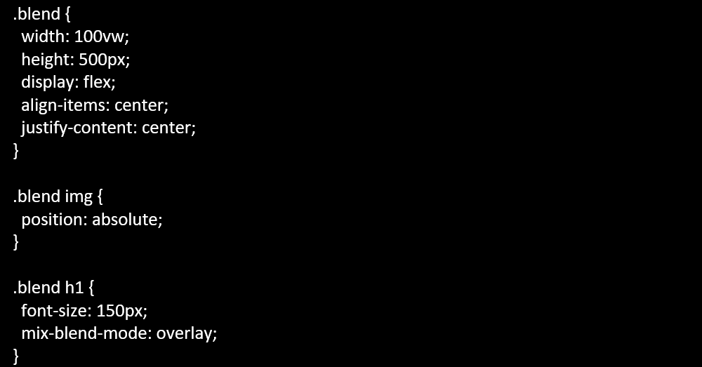
Here’s a sample code to show how you can work with blend modes:
Consequently, the code above uses the mix-blend-mode property, which blends a text and header element with an image. On the other hand, the code below uses the background-blend-mode property (overlay) to blend the background image with a color (#20126f).
THREE: Employ Parallax Scrolling
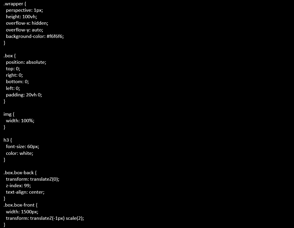
Additionally, if you employ parallax scrolling on your website, you will create an effect that shows a foreground CSS element moving at a different pace with the background CSS element as you scroll up or down (or even left or right).
Here’s a sample code that uses “transform: translateZ” to slow down or speed up an element’s movement as you scroll up or down:
FOUR: Use Shape Outside Property
Next, another CSS trick and tip that you can implement on your website is the shape-outside property. With this, you can define how an element will wrap around a floated element.
Check out this sample code below using a circle and how it allows text to overflow the shape:
FIVE: Truncate the String with Text Overflow
Aside from using JavaScript, you can also cut the text by truncating the string using the text-overflow property. Here’s a sample code showing how you can do it:
As a result, the code above allows you to hide the overflow and end it with three dots (ellipsis), which signifies that you have cut the text.
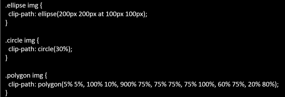
SIX: Utilize Clip Path Property
Then, if you want to place an image inside a specific shape, you can use this CSS trick and tip! The sample code below uses the clip-path property to place an image inside an ellipse, a circle, and a custom polygon shape:
SEVEN: Set Elements to Full Height and Full Width
In addition, we can also make it so that our web elements adjust to the viewport. You can do this using the “vh” and “vw” units, wherein “vh” means it is 100% height of the viewport and “vw” means it is 100% width of the viewport. Here’s how it looks like in code:
In the example, we have set the element at 75vw and 75vh. Thus, it has a width and height of 75% relative to the viewport.
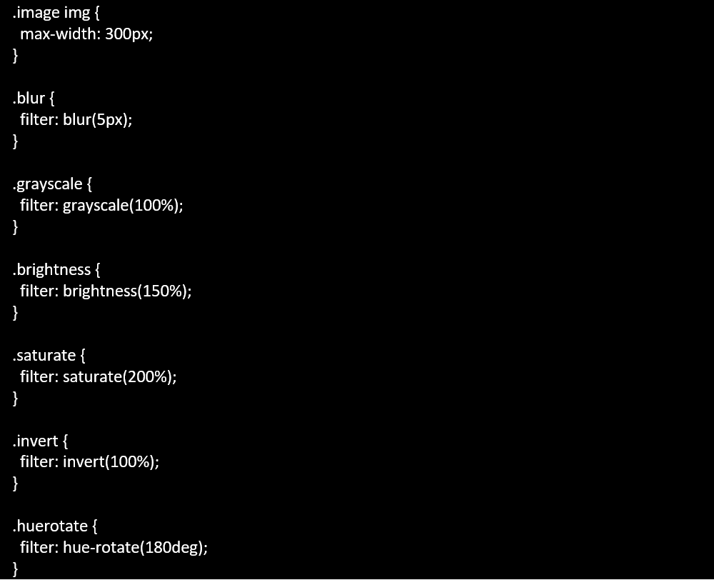
EIGHT: Apply Image Filters
Fortunately, you do not have to keep on using Adobe Photoshop to apply filters to your images. A CSS trick and tip that you can do is apply filters to your pictures. Here are some sample codes to apply a filter to your images:
Thus, the codes above apply the following filters to the same image: blur, grayscale, brightness, saturate, invert, hue rotate. You can apply more image filters using CSS!
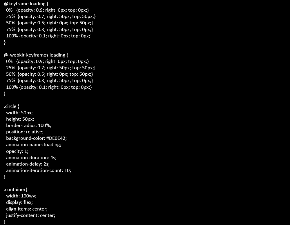
NINE: Experiment with CSS Animations
One of the best ways to guarantee that your users continue browsing your site is using animations. Check out how this sample code applies animations using CSS:
As a result, the code above animates a small dot that changes position and opacity every 25% until it reaches 100%. Then, it starts all over again. There are a lot of CSS elements, including shapes, colors, and sizes, that you can animate using CSS.
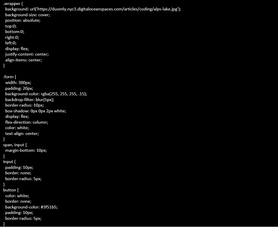
TEN: Use Frosted Glass CSS
The frosted glass effect is one of the most popular CSS tricks and tips you should use in your web design. Here’s a sample code showing how you can apply it in your design:
Need Help Applying These CSS Tricks and Tips?
So, don’t let your competitors get all the action. Therefore, take this article from a web design company from the Philippines as a sign to create a stunning and interactive website for your business!
Then, if you need help applying these CSS tricks and tips, do not hesitate to let us know in the comments section below. Let’s build your website together!





![[New] Syntactics - OMT - May - Visual Search & Tips for Optimizing Site Images (1)](https://syntacticsinc.com/wp-content/uploads/2023/05/New-Syntactics-OMT-May-Visual-Search-Tips-for-Optimizing-Site-Images-1-346x195.png)





Comment 0