
Designing Above the Fold Websites
Website design services help ensure that the landing page of a business website immediately showcases content through above the fold web designs. With this, you can encourage customers to explore your site, increase your revenue, and achieve your overall business goals.
As such, this article will tackle the concept of above the fold websites, and how you can employ it as a digital marketing strategy.
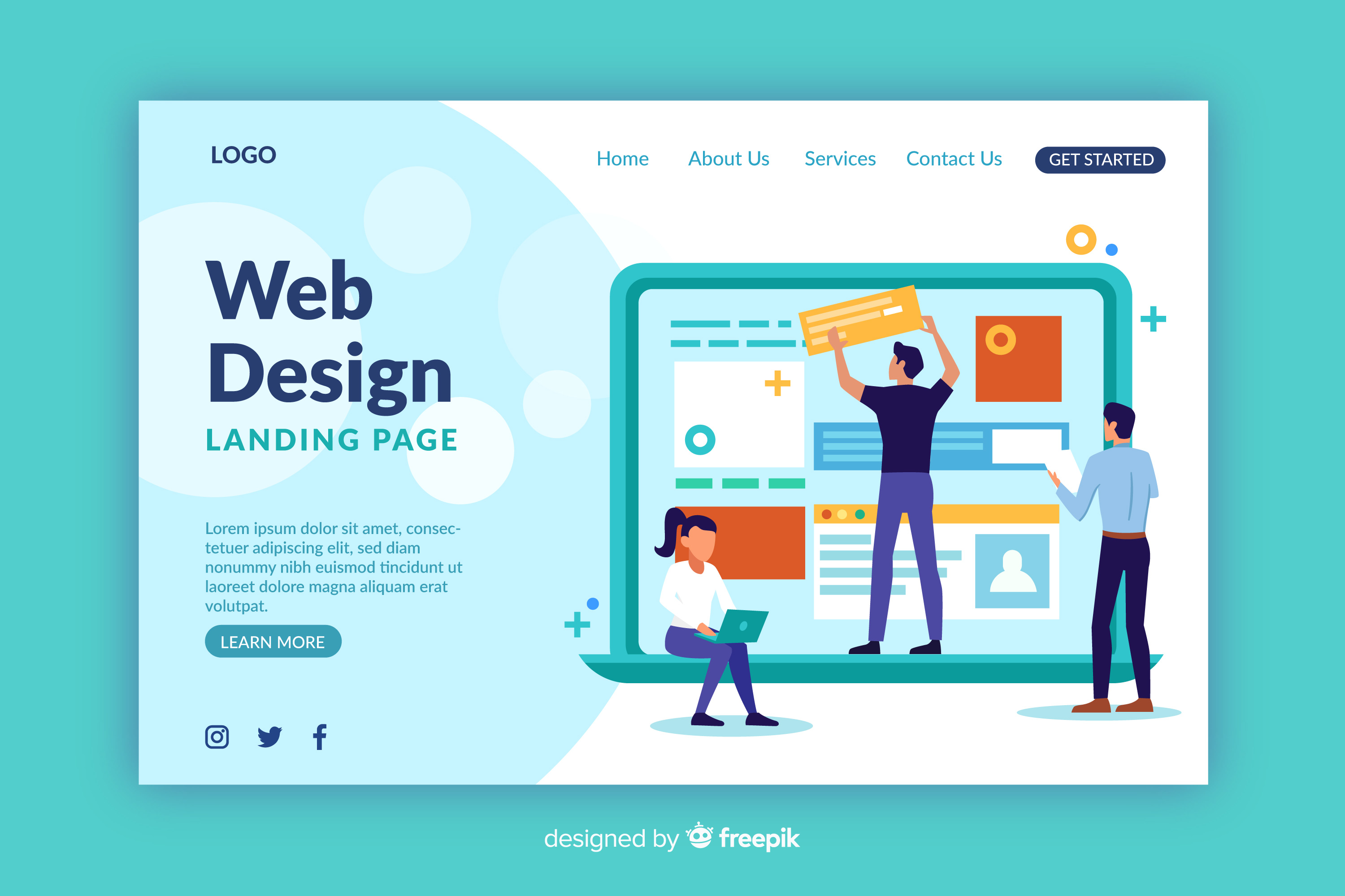
Image Source: Freepik
Above the Fold Websites
Before there were electronic devices, people heard of stories and learned of personal narratives through newspapers. However, whenever newspapers were displayed on newsstands, they were too large to display. Because of this, newsstand owners decided to fold them crosswise. From this practice, comes the term “above the fold,” wherein publishers would ensure that their headlines and lead stories would appear literally above the fold where they are most visible. From then on, they would place catchy headlines and dynamic pictures above the fold to attract their readers’ attention and encourage them to purchase.
With the advancements in technology, businesses and web design companies in the Philippines employ a similar approach in the marketing of their products and services online. Today, the above the fold is considered as the browser window’s bottom part. It is approximately 600 pixels from the top of the page. It is the part that site visitors see upon landing on a website. Thus, business owners need to place here what their organization does and the benefits that their customers will get. Also, as another way to create modernized websites, the above the fold content helps encourage site visitors to explore more on what the site has to offer.
The Significance of Above the Fold Websites
When dealing with above the fold, Optimizely states that the placement and layout of the content are of utmost importance. As such, you should only place the most important content that would help you achieve your business objectives. Thus, you must immediately present them with the information or solution that they are looking for to keep them from bouncing onto another site.
Relatively, placing ads above the fold increases their visibility and generates more ad revenues. Moreover, placing your CTAs above the fold also helps you lead to higher conversion rates.
Design Practices for Above the Fold Websites
-
Keep Designs Simple
The usual reason why people visit websites is that they are looking for solutions to their problems. As such, upon arriving at your business website, make sure not to overwhelm your site users with too much information. Otherwise, they will have difficulty finding what they are looking for, which could potentially make them click away from your page.
Thus, you must try to keep your page looking organized, professional, and user-friendly. You can place one featured image, a GIF, or a video to grab their attention. Then, place a short yet catchy headline with a few bullets below it listing about what you have to offer.
-
Create Engaging Content
Try to keep your content engaging to ensure that a site visitor keeps on browsing on your website. When placing a call-to-action on a particular page, instead of using the commonly-used “Read on” or “Click here”, try to be more creative.
You can also try to place a GIF or a short clip to deliver a message instead of static images. Then, you can even try to splash two to three colors on your page, while sticking to your branding to achieve consistency across your site.
-
Design Functioning Content
Keep user experience in mind when creating designs. Contents found above the fold should be easy to interact with. For instance, if you have a product page that features a video clip that showcases your offerings, then make sure that the video is functioning as it should.
Again, consider user experience by featuring video content that plays automatically but stays on silent mode. You can also place subtitles to ensure that they understand even without sound.
Designing Above the Fold Websites
-
Measurement
There are different kinds of monitor sizes and screen resolutions for desktops and laptops. They also vary in browsers used. Aside from that, you also have to take into consideration the various models of phones and tablets.
Nevertheless, web designers have agreed on an average fold placement for all types of devices, monitor sizes, and screen resolutions. They approximate the above the fold line at 1,000 pixels wide and 600 pixels tall for the most commonly-used monitor-browser combination of 1024×786 pixels.
You can review your business website’s analytics program such as Google Analytics to tell you what screen dimensions are commonly used by your site visitors.
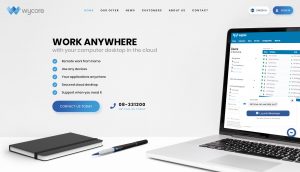
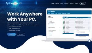
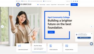
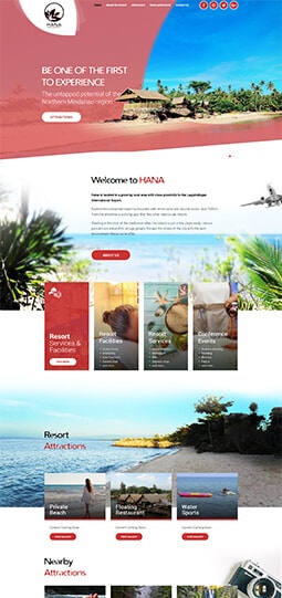
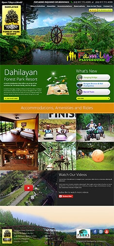
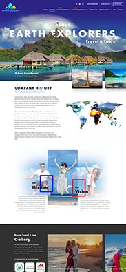
Illustrated below are sample web designs employing the above the fold concept for desktop/laptop, tablet, and mobile devices.
-
Flexibility
Today, there are various types of screen sizes among mobile devices. To add to that, most mobile phone users browse websites in portrait mode instead of the usual landscape mode.
Due to this, web designers employ responsive design in the creation of above the fold web designs, where web pages make use of flexible layouts, images, and cascading style sheets. Through this, web page content reflows following the screen size of the device and the browser used.
-
Optimization
Getting the right placement of your ads and content requires a repetitive process of analyzing, testing, and experimenting. So, start going through your analytics program and determine the demographics of your site visitors. You can identify the browsers, the screen sizes, and the type of device that they use. Through this, you can create a set of baseline metrics to understand how users interact with your site.
From this, you can generate and test your hypothesis. Find creative ways to organize your content and ad placements. You can make use of the A/B testing method and move elements around a page to see which placement works best.

Image Source: Syntactics
Hire a Dedicated Web Designer for Your Above the Fold Website
As a business owner, you may not have enough time to ensure that your site is functioning as it should while looking its best to entice a customer with one glance. Thus, now would be the perfect time to hire a dedicated web designer for your web pages.
If we missed other considerations on how to design above the fold websites, let us know in the comments section below!











Comment 0