Designing For Great User Interface and User Experience with Marvin Consuegra
November 19, 2014 – Cagayan de Oro City, Philippines – Syntactics, Inc. organized a seminar & workshop training day for the Web & Apps Team and selected members from the Online Marketing Team on User Interface and User Experience (UI/UX). This training was held in the Syntactics, Inc. office on Nov. 15, with a web designer and startup founder Marvin Consuegra as the resource speaker.
Marvin Consuegra, also known as “Marx” Consuegra, is well-known for his skills in graphic design, web design, product design and application design. He’s even known to be one of the pioneering digital designers in Davao City being the founder of the Davao United Association of Animators and Designers.
Mr. Consuegra is also quite active in the startup scene, having been one of the mentors for the first Startup Weekend CDO. He founded a couple of his own startups which are called Pagesnapp and Meal Sprout and he has been to Manila and then Silicon Valley for the Angel Hack hackathon competition.
The Web, Apps & Online Marketing Teams learned from Mr. Consuegra the clear difference between User Interface (UI) and User Experience (UX). To summarize, here are short descriptions of UI and UX according to Mr. Marvin Consuegra:
UI – similar to the skin of the human body, the UI speaks more of the general look and aesthetics of a website or application.
UX – similar to the organs of the human body, the UX focuses more on the website or application’s functionality, usability, and ease of use.
A few of the important topics Mr. Consuegra covered were some things to remember when designing for optimal UI & UX, the elements of UX, and creating a design that converts. For his topic on designing for conversion, here are some of the tips and examples he shared with the Syntactics, Inc. designers and developers:
- Place the most important sections/topics first with an Above The Fold design
- Use segmentations such as categories and pop-ups
- Good website copy is important, even on the buttons. Make buttons similar to mini-CTAs or call to actions where they are personalized and attention-catching.Ex. For a digital marketing website:”Click Here for a Quote” -> “Start Building Your Strategy With Us Now!”
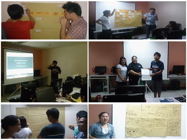
After his talk and a break, Mr. Consuegra divided the participants into eight teams for a couple of workshop exercises. For the first workshop, the teams were asked to create an initial structure for a sports enthusiast website using the Card Sorting Technique he discussed earlier. The purpose of this activity was to introduce another effective and team-oriented method of planning a website to the participants.
For the second activity, the same eight teams were asked to come up with a product storyboard. The teams came up with personas who each had their own problems, and were introduced a product or brand that solved the said problem. This particular exercise helped give participants an idea of building a brand or product that people actually need, thus making it saleable.
After the workshops, Mr. Consuegra shared one of his design works to the participants and ended the training with a statement to remember: “Don’t just design for beauty, design for functionality.”





Comment 0