
Effective Landing Pages: 5 Things To Consider During The Design Phase
Have you ever tried clicking a Call To Action (CTA) button and got redirected? The page you ended up in is a form of an effective landing page. And as its name suggests, a landing page is where clients land when they click on optimized search engine results. Visitors could also be coming from other marketing campaigns like email subscriptions, social media posts, or personalized ads. You’ll need effective landing pages developed for one of two specific purposes. These are either for (1) capturing more leads or (2) serving as middlemen that guide your clients towards sealing the deal.
With that said, keep these tips in mind the next time you’re working with landing page creators or designing and creating your own landing page:
Keep It Short
Whether you’re writing a copy, contact form, or product description—keep them all short. This technique follows the general principle of minimalism and simplicity. With this, anything that may distract them from those processes may negatively impact your desired results. Be conscious of the number of details you present to your clients and avoid adding too much to prevent clutter. Moreover, don’t require too many pieces of information. You can include a contact form on your landing page, but limit the number of fields they’ll need to fill in. You can ask to follow up questions, especially those that involve transactions when they’re necessary. Sometimes, less is truly more.
Sell Yourself
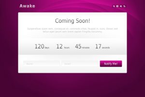
Place yourself in your clients’ shoes. They clicked on your CTA because they were offered something of value to them. Otherwise, they would simply be minding their own business and go about their day. For that reason, focus on further promoting what you’re already offering them. In addition, tone down the sales talks revolving around your brand as a whole. Above all else, one sure-fire way to guarantee that it’s effective is to make sure that it’s a conversion-optimized landing page.
Source: flickr.com
Trust Signals
You may encounter customers who may have second thoughts about purchasing your products or availing of your services. Regardless of their reason for not being 100% on board, you can turn these situations into additional marketing opportunities. To start off, give them a slight nudge—a little confidence boost— that your company is professional, competent, and reliable with a few, carefully selected and placed trust signals.
Essentially, trust signals are symbols that provide your clients with the confidence they need. Place any related accreditations, certifications, and awards on the page. This goes the same way for displaying your previous work or the logos of the brands you’ve previously worked on. For added points credited to your social proof, you can place a carousel of the best testimonials you’ve received. And finally, you can place your own ‘guarantee’ symbols—whether that’s for their money-back in case of any defects or a year’s worth of warranty.
Testing
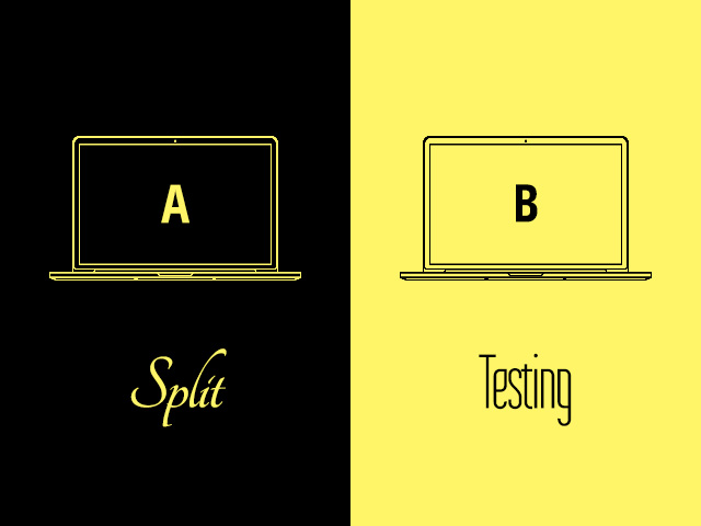
Just like the rest of your website’s pages, make sure you undergo thorough Split Testing on your landing pages. This is also known as A/B Testing. When you perform this method of testing, you set a control (A) page and a variation (B) of the page. For example, set your current landing page as Control A. Then, alter the element (such as your title or heading, contact form, or CTA button) of your choice and set the second page as Variation B. Proceed to compare the results you’ve gathered. From there, you can continue modifying your landing page from there until you’re satisfied.
Source: flickr.com
Meanwhile, others prefer to perform Multivariate tests, wherein multiple combinations of their page’s elements are varied rather than switching them out one at a time. In the end, it’s best to figure out which method works better for you given your project’s timeline and stick to it.
Make It Responsive
It’s highly likely that you’ve already made your blog posts and other products and services pages responsive as a Search Engine Optimization (SEO) strategy. Your landing page should be no different from them. Be inclusive and appeal to every user on every device. This way, you can prevent them from losing their focus when they strive to zoom in to read the details—if they do so in the first place, considering an unresponsive page can easily prompt them to click off.
Develop Effective Landing Pages Today!
In summary, effective landing pages truly shine when you design them in such a way that they get your customers hooked and stay focused. Regularly view the page from your target market’s perspective to determine whether you’re on the right path. Moreover, don’t be afraid to try designing your page elements into a variety of different combinations to learn which best serves you.
Know what you’re looking for? Interested in creating a brand new landing page or redesigning one you’ve already got? Improve your lead generation and conversion strategies today by working with the right landing page creation service today!







Comment 0