
How to Create eCommerce Product Pages That Sell
The most crucial part of an eCommerce website is its Product Pages. As a result, eCommerce Website Specialists aim to create Web Designs that convert site visitors into loyal customers. You can also use several Best Practices to set up eCommerce Product Pages that sell.
Fortunately, Product Page Optimization can ensure you create high-selling and -converting pages. After all, every eCommerce Website Owner wants to get the most out of their online store.
Many eCommerce marketers swear by Conversion Rate Optimization as the most effective means to increase their online stores’ conversion rates. To figure out what sort of eCommerce Website Design works best for them, marketers use methods such as:
- heatmaps;
- A/B Testing;
- form analysis, etc.
These methods allow them to gather visitor behavior data and make the necessary changes to the web pages. So, eCommerce site owners must get started with the Best Practices to maximize their Product Pages’ success rates.
Tips for Creating High-Selling eCommerce Product Pages
To build a successful eCommerce business, you must create high-converting Product Pages. Your product pages help your target audience decide whether you’re selling what they need or just wasting their money.
Product prices and item quality aren’t the only factors that influence whether or not the customer clicks “Add to Cart.” So, you must ensure that customers’ Page Experience is smooth to coax visitors to make purchases from your eCommerce store.
Here are several measures you can take to enhance your product pages’ User Experience or UX:
Use High-Quality Photos
It’s vital to use high-quality visuals on your eCommerce Website Pages. This way, you can allow your customers to view even the tiniest details of a product. Conversely, if you add low-quality, blurry images to your site, the product listing will look unprofessional.
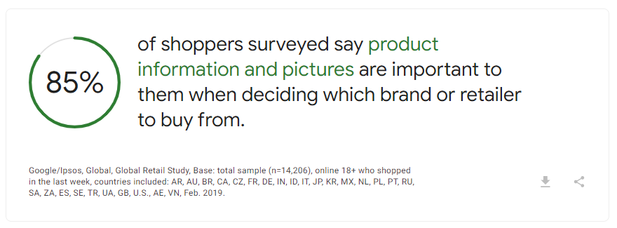
Source: Think with Google.
Thus, eCommerce Website owners should invest in good photography and add high-quality product images on pages to entice viewers. Use large image files that can be zoomed in without losing image quality. However, following Image Optimization practices is essential to avoid slowing down your website.
Another Product Page Best Practice is to provide them with a 360-degree view of your products with a GIF. Alternatively, you can utilize multiple product images taken from different angles. You can also give your site visitors a detailed look via product videos.
Helping customers visualize an item can do wonders for your business! Not only that, but high-quality images speak to your professionalism as an eCommerce store.
Add Exciting Copy to Product Descriptions
A picture is equivalent to a thousand words, but a product listing copy can communicate critical information to shoppers. A highly persuasive, engaging, and informative product copy is crucial in engaging your customers and influencing their purchasing decisions.
Unique and well-written Product Descriptions can draw in online shoppers and explain several vital details, such as:
- The product’s size or dimensions;
- Item color or color variations;
- The material(s) used to create the product;
- The product’s price;
- Shipping details; and
- Other related products, etc.
Persuasive descriptions can make a case to your target audience that your product is the best compared to competitors. But it’s also important to format it in a way that’s easy for shoppers to read and understand. So consider using bullet points and short paragraphs in the descriptions!
However, it’s not enough to add vital details about an item. You must also utilize SEO strategies, including product-related keywords in the listing.
Add Compelling CTA Buttons
A persuasive Call To Action can spur your shoppers into making a purchase. It’s one of the most critical elements of your eCommerce Product Page. By clicking ‘Add to Cart,’ your site visitors get closer to becoming paying customers. After all, they’ve made the plunge and are willing to make a purchase.
Also, because it encourages site visitors to take a particular action, a CTA button can improve your Technical SEO.
Call-To-Action button labels such as “Add to Cart,” “Buy Now,” and “Proceed to Checkout” are customary for eCommerce Websites. But you must remember that your CTAs should be compelling, consistent, and highly visible. So, if you want a customer to purchase your products, a generic CTA might not cut it. So, you must add a personalized flair to your buttons to improve conversions.
You can make buttons more visible by using colors that stand out from the rest of the design and color scheme. Also, you must make your CTAs large enough to be identifiable.
Showcase Customer Reviews
Most shoppers look for reviews on eCommerce Product Pages about the item they wish to buy. For instance, 93% of online consumers read reviews before making a purchase. Thus, you must help encourage your customers to buy using social proof.
Social proof is instrumental in establishing your eCommerce business’ credibility. But, the best reviews are from customers who have previously purchased your products. They can give your customers insights into their potential purchase decision. In addition to product reviews, you can also add any of the following:
- Customer ratings;
- Customer case studies;
- Social Media share buttons; and
- User-Generated Content.
Provide Price Comparisons and Options
With this Product Page Best Practice, you can let customers see how much they can save if they purchase. Try to give your customers a comparison of prices, especially when offering special promotions on your products.
You can compare the regular price to the discounted one to entice people into buying from your online store. Thus, you should add the discount percentage and discounted amount from the purchase. These amounts should be placed prominently on the listing!
Another excellent way to improve your eCommerce Website’s User Experience is cross-selling. This way, website visitors can check related products if the one they’re looking for isn’t available. In addition, doing so allows more site visitors to complete their purchase without altogether leaving the Marketing Funnel.
So, you must show how competitive your eCommerce store’s prices are compared to your competitors!
Display Shipping and Returns Information
Most shoppers get disappointed during the checkout process, because they find out they still need to pay for additional costs. After all, surprise shipping charges are one of the leading causes of shopping cart abandonment.
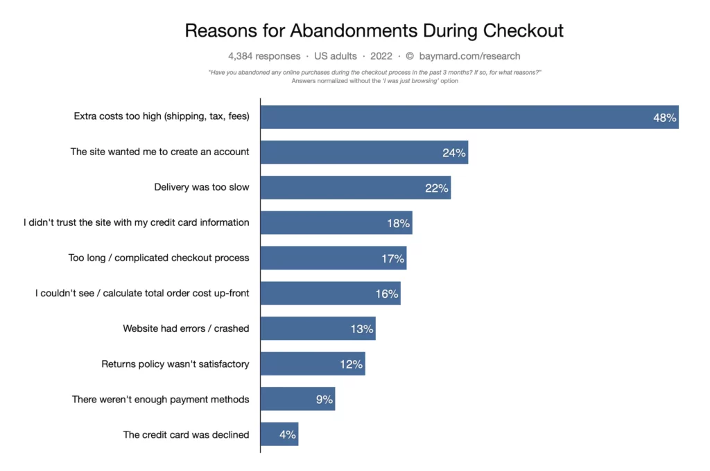
Source: Baymard Institute.
To avoid this, display your shipping information on your eCommerce Product Pages right from the start. Your ideal audience will appreciate honesty when it comes to product charges. Thus, you must show your shipping policies on your homepage and product listings. This way, you can remove any later confusion for customers.
Also, you must provide clear information on your return policies, whether they have 10 days or 30 to return their purchase. Perhaps your store has no procedure, so you must put that policy front and center to avoid future concerns.
Tag “Out of Stock” Products
Don’t let your shoppers reach the checkout page just to be notified that the product is no longer available. Having enough stock for your customers is critical for a successful eCommerce store. However, there are times when there’s insufficient supply.
If you’ve already run out of stock, you must tag those products immediately to avoid wasting your customers’ time. This is a far better alternative than not informing buyers that the item is unavailable on the Product Page itself. Of course, there’s a chance that people will leave to find an alternative shop, but they’ll appreciate your honesty.
After breaking the news to shoppers, you should allow them to sign up for notifications. Then, if they know when the product is available again, you can avoid causing a wrinkle in the customers’ shopping experience.
Create a Sense of Urgency
Creating a sense of urgency through your eCommerce website can cause shoppers to act instantly. In addition, you can influence purchasing decisions by informing them of product scarcity.
Thus, another Product Page Best Practice is to make customers realize they should purchase as soon as possible. Otherwise, your special promos may not be around the next time they visit your website.
For instance, you can set deadlines for your discounts and product offerings. Also, you can tell them that only a few pieces of the product remain available.
Inform people on the page itself that an item is selling out fast to influence them to purchase it immediately! Overall, your product listings should influence shoppers to buy products.
Utilize Live Chatting and Social Sharing
Support is key to ensuring customer satisfaction. Thus, one eCommerce Website Best Practice is to integrate a live chat box on all web pages, especially your Product Pages. As a result, you provide your customers with a venue to ask queries, make comments, and send suggestions about your offerings.
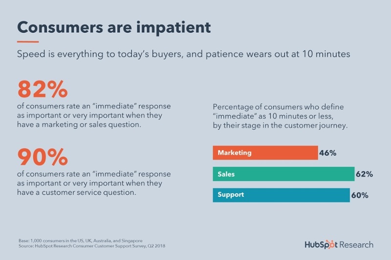
Source: Hubspot.
It’s a way for you to communicate with site visitors about the following:
- Sizing;
- Product quality;
- Customer service commitments; and
- Return policies.
Make your product page as user-friendly as possible by answering all FAQs. That way, you can avoid leaving anything to the imagination of your users. In addition, you can add Messenger to your website or place Social Media buttons. These will allow potential buyers to share your products on the appropriate platforms.
Optimize Page Loading Speed
Website users are all about fast page loading speeds, no more than three seconds. Unfortunately, slow pages often discourage site visitors from continuing to explore the website.
A Web Design and Development Company can optimize your web page loading speed, so it loads in two seconds or less. For example, “47% of online shoppers” expect an eCommerce Website’s pages to load in under two seconds. Also, they can make your pages responsive to any browser and device to avoid losing any chance of conversion.
Here are critical methods for enhancing your eCommerce Site’s speed:
- Ensure you’re using the latest version of your Content Management System or website builder.
- Reduce your eCommerce website’s HTTP requests.
- Compress the files on your eCommerce sites, particularly your images.
- Ensure all website links function properly — avoid having broken links on your pages!
- Optimize your website for mobile devices.
- Test your site’s page speed with Google PageSpeed Insights to find problem areas. Afterward, follow the tool’s recommendations.
Utilize Mobile-Friendly Page Design
You need a Website Design that’s aesthetically-pleasing, but will also help convert site visitors into customers. Otherwise, your eCommerce Website will lose leads and revenue.
Mobile-Friendly Websites are necessary to get the attention of a global audience that favors mobile phones over desktop devices. Google is already prioritizing mobile with its Mobile-First Indexing policy.
Not only should your site look good on mobile and desktop, but it must also load in under two seconds. In addition, your content, including media files and copy, must be readable and arranged attractively to improve your Conversion Rates.
Ensure your eCommerce Site can cater to potential customers on mobile by using Mobile-Responsive design!
Make Product Page Navigation Easy
It’s a Product Page Best Practice to ensure that the page is neither lacking nor stuffed with information. Thus, you ought to have a well-designed eCommerce site to increase the stickiness factor.
After all, visitors can’t touch or wear your eCommerce products before purchasing. Instead, a Product Page’s design and content determine whether or not a site visitor turns into a buyer.
After visitors land on your eCommerce site, they should be able to navigate to your item listings. Your Bounce Rates will increase if customers can’t easily access your item or category pages.
To ensure a seamless UX, you must provide straightforward navigation to your item catalogs. This should also be the case if a visitor lands on a blog page or your home- or Landing Page. So, avoid adding too many navigational buttons, and make sure those page elements are distributed logically throughout the page.
Reassure Customers with Customer Support
A Frequently Asked Questions section is necessary to ensure customers don’t bother you with common queries. This strategy frees up your time and ensures people can get immediate answers to their concerns.
In addition, customer support services can influence a buyer’s final decision. For example, using live chatbots allows faster response times and improved customer satisfaction.
Also, customers need to provide personal information when making a purchase. For example, one eCommerce Product Page Best Practice is telling them their data remains safe post-checkout. Then, after the purchase, you can reassure them with a short message.
Alternatively, you can show them website security safety certifications on your website to get their trust. It also helps ensure that your site visitors return to your eCommerce Product Pages to make another purchase.
Final Thoughts
eCommerce Website owners should set up a digital presence that taps into the vast number of online shoppers across the globe. Of course, your target audience will appreciate an eCommerce Website with a pleasing, responsive design.
Your Product Pages can significantly affect your site performance for the better. There are many ways to improve your item pages’ eCommerce transactions, such as:
- Using high-quality images;
- Adding informative, persuasive copy;
- Utilizing compelling Calls-To-Action;
- Using customer reviews as social proof;
- Providing price comparisons;
- Being candid about shipping and returns policies;
- Tagging product listings that are out of stock;
- Utilizing Mobile-Friendly page design;
- Offering customer support, etc.
There’s no shortage of strategies for improving your business’ progress. But, you must adjust your eCommerce Site Design to your shop’s niche, branding, and other needs. Fortunately, eCommerce Website Specialists can craft attractive, high-converting Product Pages for your business.
Consider using eCommerce Website Design and Development Services to implement Product Page Best Practices discussed here.













Comment 0