Google Mobile Search Showcases Favicons on Results
As of this week, changes starting with the mobile search results are now widely rolled out. As far as our test goes, several devices are displaying the expected changes, including Android and iOS.
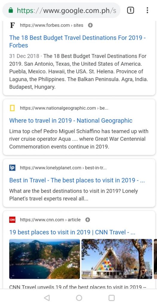
Google just made a few noticeable updates in its search results, starting with mobile. The most apparent changes are the following:
- In the organic listings, you can now see the favicons at the top left of each card
- Next to the favicons are the site URLs, which used to be below the main page title.
- URLs are now colored black, instead of green.
- Google AMP lightning bolts are placed on the top right.
- Advertisements have an “Ad” favicon.
- The gray line which appeared under each main page title has been removed by Google.
At Google I/O, the search engine giant recently announced regarding the planned change in the display of the Google Mobile Search results. It makes sense as the favicons play an essential role in helping users identify and decide easily what link to explore next. It also supports site owners and SEO experts in improving their branding.
With these changes, favicons get a visual boost. Your site must have a favicon to represent your brand visually. Google has posted some guidelines on favicons which you need to check out.
According to Google’s blog regarding this update:
“With this new design, a website’s branding can be front and center, helping you better understand where the information is coming from and what pages have what you’re looking for.“


Comment 0