
Graphic Design Brochure Tips and Tricks to Follow
Digital Marketing is critical to making a business more visible to potential customers. Still, creative brochures can be of assistance to your business. So, it’s crucial to gain better Brochure Graphic Design Ideas and check out examples and Templates. Additionally, there are plenty of Brochure Design tips and tricks marketers can utilize.
Business owners must continually find new ways of marketing their brand and its products or services. Though brochures aren’t a strictly Online Marketing staple, they’re still beneficial to a brand’s overall Marketing Strategies. According to Bentley University research, 85% of people who pick up brochures are made “aware of an attraction or business.”
However, you must utilize tried and tested design principles to ensure your brochure gets picked up. After all, there are various business brochures today, and marketers need to design one that makes an impression on potential customers.
First off, you need to create a business brochure with a striking design to entice people. It should provide value to readers by showing off your business’s benefits, products, or services.
Using Brochures for Your Business
Brochures are foldable marketing materials with several purposes, as they can support current campaigns and boost brand awareness via event distribution.
Naturally, marketers must make an informative, well-designed brochure to gain people’s attention. Fortunately, you can apply Graphic Design Rules to ensure that your marketing brochures can boost your business’ visibility.
If you want your brochure to compel potential customers to convert, you must use eye-catching design. Brochures aren’t popular in Online Marketing, but it’s a valuable way to spread your business’ reach. So, you must pack it (though not overly so) with information for educating readers while sharing what your business can offer.
Creating brochures can complement and maximize your marketing efforts regardless of your business’ industry or size. Also, marketers wouldn’t want to use the same Graphic Design Template for a luxury brand as a business college.
So, marketers should consider several design steps when creating an engaging corporate brochure.
Graphic Design Brochure Ideas: Creation Tips
Determine the Goal
Before you start Graphic Design Ideas for your brochure, you need to identify its purpose. In addition, the brochure design has to follow your intended message. Thus, marketers should consider what sort of information they want to convey.
- Do you want to educate readers about your business?
- Are you going to provide data or updates on your industry?
- Is there an upcoming business-related event you wish to advertise to customers?
- Will the brochure talk about your company’s new product lineup?
- Alternatively, do you intend to explain how your service works?
- Are you advertising special or limited-time offers?
Settling on a goal can give marketers insight into the content they need to add to the layout. With it in mind, Graphic Designers can craft a creative brochure that can accurately communicate the intended message. Also, having a clear purpose can help marketers avoid creating poor or confusing designs.
Consider Your Audience
Knowing your target audience is crucial to creating an effective Graphic Design Brochure Template. Marketers intend for as many people as possible to read their business brochures. But to ensure their message can effectively convert readers, they must choose to cater their marketing materials to a specific audience.
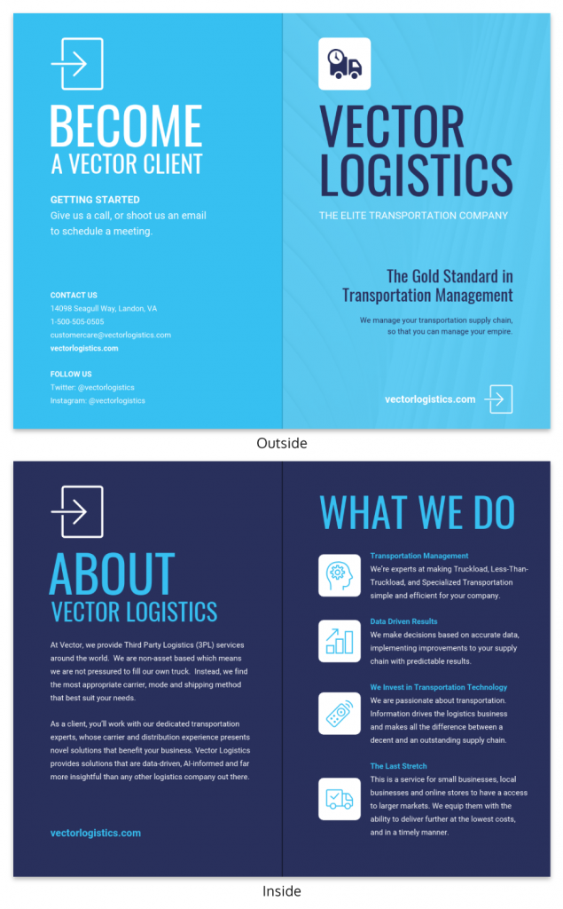
Source: Venngage.
As you prepare your brochure, you must remember the audience it’s directed at. Fortunately, customer data can provide a comprehensive picture of what your brochure must look like. So, for instance, if your marketing is aimed at medical professionals, your brochure won’t be effective for people from the construction industry.
Another consideration is where you’ll distribute your professionally-designed brochure. You must consider what places it can show up and how they might grab people’s attention. Lastly, they might not be the only brochures displayed, and you need to create an enticing Graphic Design Idea to make them unique.
Plan Ahead
Marketers must create a plan for their company’s brochure content. Of course, a plan for the Brochure Template can give Graphic Designers an excellent idea of how the final product will look. Not only that, but it must align with the business’ branding.
Marketers can use outlines separated into sections according to the desired fold layout. Use your space wisely and plan the size of the content and its placement.
So, it’s critical to plan your visuals and copy ahead of time, as brochures only have limited space. Firstly, marketers must remember to apply a simple design, if not a minimalistic one. It’s best not to overload your readers with too much information.
Thus, you can plan the brochure’s design according to its goal, content, and target audience. In addition, marketers should consider applying psychological principles in Graphic Design to improve their brochure’s effectiveness.
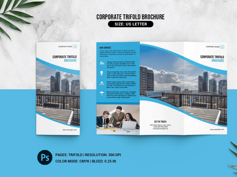
Source: Dribbble.
Select a Brochure Layout
You’ve found your goal and know who to cater to, but the information conveyed via Graphic Design will also depend on the layout. You have limited space for content, so you must choose a format wisely. Here are some examples of brochure layouts for your Graphic Design Ideas:
- Bi-fold
- Tri-fold
- Z-fold
- Accordion-fold
- Gate-fold
- Two-fold
- Die-cut
- Unique folds
To maximize your design, you can span your content across the layout or use specially-cut fold types. The brochure’s fold can be as unique as you want — as long as it fits your brand identity and the message you want to convey. Of course, you can always use a Graphic Design Brochure template from programs like Canva or build one from scratch.
Create the Content
After settling on the goal, target audience, layout, and overall plan, marketers and Graphic Designers can get started on content. Naturally, all brochures have the following elements:
- Business logo;
- Color palette;
- Fonts;
- Visuals and images;
- Company sayings or slogans;
- Text or copy; and
- Contact details.
You must also consider the brochure’s paper stock, as it can make or break the experience.
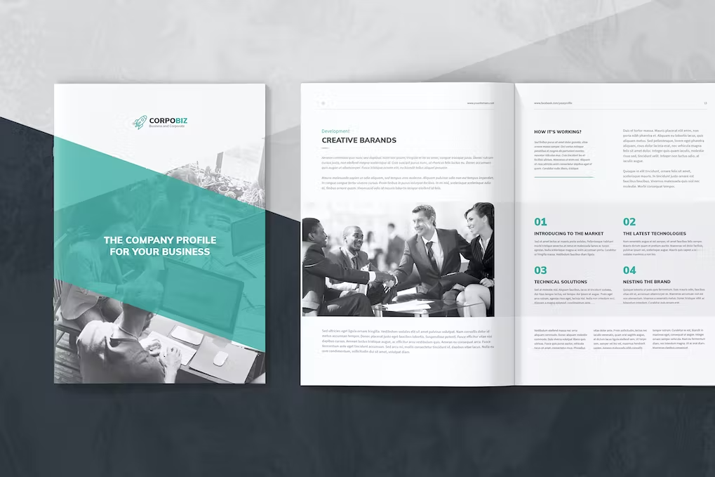
Source: Envato Elements.
Naturally, one must create content that’s easy to break up according to page layouts. Thus, your paragraphs should be short and digestible. It’s also critical to preserve enough white space to help the design look less cluttered.
Calls-To-Action on brochures are different from those on websites or Social Media pages. You must influence readers to reach your business online because brochures are traditional advertising materials. You can add your Social Media handles or a QR code to make things easier.
Follow Your Branding
Sticking to your business’ brand identity is crucial to creating a brochure. Brand consistency significantly impacts how audiences see your business, as it boosts revenue by 20%.
So, you must follow your designated color schemes, font styles, visual design elements, etc. They can ensure better consistency and, thus, brand recognition! Moreover, you need to add your brand logo to the brochure.
Though branding is critical, there may be situations where you don’t need to follow your fonts or color schemes strictly. It depends on the brochure’s intent, but design elements are often complementary to your business’ branding.
Add Copy or Text
Copy is critical for your brochure, as it’s the main vessel of your message. Thus, if you have attractive visuals but poorly-written content, readers will notice and have a less-than-stellar opinion of your brand.
Additionally, you must ensure that your copy is concise and fits nicely on your brochure folds. The text must also work well with your images, headings, and gutters.
Naturally, your CTAs are also part of content creation. Before you make the enticing sentence for people to take the next step in their customer journey, you must build up to it. You need to put readers’ doubts to rest or share more information about what your business has to offer.
Finally, add your contact information so people can get in touch with your brand. This will include your
- website URL;
- email address;
- telephone or mobile number;
- Social Media handle(s); and
- office address.
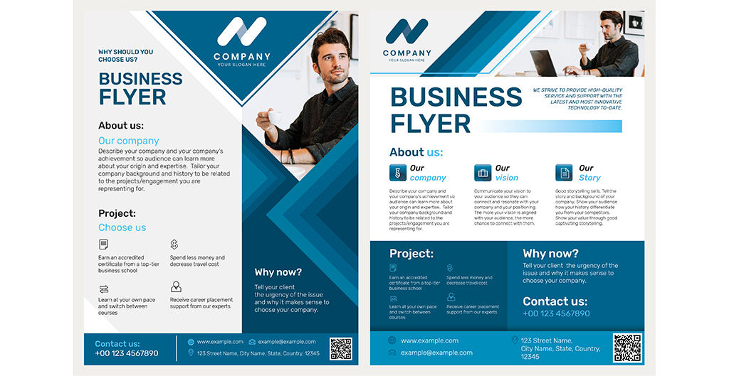
Source: Freepik.
Apply Exciting Images
High-quality, exciting visuals are essential to creating a corporate brochure. They’re just as critical to your marketing materials as copy and, for some, are more critical than the text.
So, you must use clear images to add to your Brochure Template. Otherwise, you’ll print out pixelated images that may turn readers away. Even if you print your brochure on top-grade paper, they can’t help the quality of low-resolution images.
It’s vital to utilize clear images that fit your business’ budget. Photo sites may charge you for pictures, but there are plenty of free image sites on the Internet. In addition, you can use current images of your products or services — provided their quality is good enough.
Proofread Before Printing
It’s recommended to print a test copy out for proofreading purposes. You may make additional edits even if the Brochure Template’s Graphic Design has been fantastic thus far. The look of a template on a screen and a physical brochure in your hands may differ.
You also want to avoid spending resources on thousands of printed materials only to realize you found a spelling error. A single mistake can break a reader’s immersion and ruin their experience! As a result, you might not see as many leads as you anticipated.
Thus, marketers should check the brochure’s design before considering it print-ready. Before printing starts, take a good look at the Brochure Template’s Graphic Design and ask yourself:
- Is the brochure design cohesive and appealing?
- Does the brochure have an easy-to-follow design hierarchy?
- Are the text and design elements balanced?
- Is there ample white space on the brochure panels or folds?
- Does the brochure follow your business’ branding elements?
Final Thoughts
Your brochure’s design will impact your business’ reputation. Firstly, it can sum up information about your business or brand, promotions, and its products or services. Then, in several cases, it can be the first glimpse of potential customers into your company.
It guides people to become aware of you, so you must provide informative marketing material that follows your brand identity. It’s not just about including your brand logo and visual elements; you must also convey your brand’s voice.
You can check out plenty of websites for brochure design inspiration, and some templates are fully editable!
Still, you must follow Brochure Graphic Design tips, tricks, and ideas to elevate your brand reputation. Fortunately, a Filipino Graphic Designer can create a brochure perfect for educating customers and boosting visibility.




Comment 0