
Using Psychology in Graphic Design
Using psychology in graphic design can significantly improve marketing materials. Just as people ascribe meanings to words and images, visual content conveys powerful meanings. Elements like color theory, font sizes, and other graphic design details are a big part of psychological principles, making visuals more compelling and purposeful.
Knowing basic psychology provides valuable insights for a marketer—especially a digital marketer. Graphic design plays a critical role in capturing the attention of potential customers. After all, visual elements can communicate a subconscious message.
For instance, a company’s logo can reveal vital information about its identity. Another excellent example of the application of psychological principles is in email marketing.
Therefore, understanding psychological concepts and techniques to evoke emotions is paramount for graphic design services experts.
Why is Graphic Design Important?
According to CXL, consumers can determine whether a brand is worth their time in 50 milliseconds. It’ll be challenging to achieve popularity with consumers if there’s only a block of text about a business on its landing page or dedicated website. Hence, great branding is crucial for a company.
Businesses stand out with unique branding, especially in the era of social media. Additionally, it’s critical for businesses to use attractive visuals. Employing psychology in graphic design is essential to attract the attention of potential customers!
Elements to Incorporate into Branding
When creating visual content like a logo or banner, a graphic designer considers several things:
The Business’ Nature
The main factor for brand identity is the nature of the business. After all, designers need to know their client before they start designing. Otherwise, they may spend a significant amount of time and effort on a design that doesn’t comply with the client’s sensibilities.
So, when creating a design for a particular business, consider what kind of business it is.
Existing Branding and Identity
Generally, a client company provides its preferences for designs early on. However, if the company already has existing branding, graphic designers will emulate it, as it’s part of their identity.
Not only that, a company needs to have a consistent brand identity. A graphic designer only breaks away from the current branding if the client company is rebranding or starting a new venture.
The Logo
The point of creating a logo is so that people can understand a company and its nature at a glance. According to FinancesOnline, it takes a person 10 seconds to judge a brand logo and up to seven exposures to recognize it.
As a result, if a branding is visually appealing, it can capture the audience’s attention. Likewise, a clear and engaging logo or other graphics will effortlessly convey the right message to people.
Thus, it’s essential that a logo has the characteristics to communicate important information about a business in a snap.
Desired Design Elements
Elements such as colors and font are the most noticeable parts of branding. Branding involves crucial design elements that create a cohesive and compelling identity for a company. These include the following:
- Logos;
- Color palettes;
- Typography;
- Imagery;
- Graphics;
- Taglines;
- Packaging;
- Website design;
- Advertising — both traditional and digital;
- UX/UI design;
- Motion graphics, etc.
Graphic Design and Color Theory
Of course, color theory studies how colors interact and combine to create visual effects. It helps anyone who works with color, such as artists and designers, make informed decisions about palettes, harmonies, and compositions.
As a result, an understanding of color theory can supercharge a brand’s message. There are many ways to apply it in graphic design for marketing.
Color Theory for Businesses
Food Businesses
Yellow and red are the go-to colors for a restaurant or food chain business. As proven by several restaurant logos, such as McDonald’s and Pizza Hut, the combination induces hunger. Adding red — the color of vigor and passion — will subconsciously spike people’s appetite.
Fast food companies don’t often use blue, but it can be part of color combinations involving yellow, red, and brown. However, blue is rarely associated with food except for bubblegum-like flavors.
Trustworthy Businesses
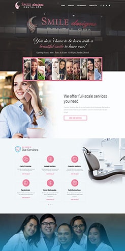
Blue has few negative connotations, though it’s associated with mourning. Still, police officers, banks, and some hospitals use it.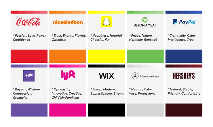
Source: Wix.com, Inc.
Luxury Businesses
Black, gold, and purple signify luxury, so businesses dealing in high-end goods or services generally use them.
Healthcare Institutions
Colors like blue and green usually characterize the healthcare industry. It may even be the same on Electronic Medical Records (EMR) Systems. Light colors are preferable as they are easier for your eyes to process.
Cultural Connotations and Considerations
Colors are also subject to cultural attitudes, such as red, the color of danger. But in India, brides wear red for weddings because of its cultural association with purity. But, in some Eastern European countries, it’s associated with communism.
Green reminds one of the healthy leaves on a tree and is the color of money in some countries. Yet, in Indonesia, it has negative connotations involving infidelity.
Consequently, the colors for branding a car dealership, trucking company, or digital business can differ widely across cultures and countries.
How to Find a Graphic Designer Who Can Apply Psychology in Design
Knowing psychology is arguably just as valuable as having graphic designer talent. After all, meanings are in people, and a designer’s job is to reach a broader audience. In fact, Brand New Graphic Design Statistics revealed that 55% of organizations use graphics to communicate with customers.
Here’s a checklist for finding a skilled graphic designer:
A Great Designer Will:
- Ensure photos, vectors, and other images are original, licensed or copyright-free.
- Follow the client’s vision or design parameters to a T.
- Understand the demographic they’re designing for.
- Adapt to any style assigned to them.
- Communicate effectively with clients.
- Get the right amount of information to create the design.
- Explain clearly why some designs may not work out and instead propose alternatives.
- Have an exciting portfolio.
Final Thoughts
Psychology in graphic design can work wonders for marketing. Since not everyone has the time to read through blocks of text about a company, eye-catching branding can save time while effectively delivering vital information.
To create a compelling business brand identity, it’s crucial to combine colors, text, font size, and other elements thoughtfully. This includes keeping cultural attitudes to colors in mind during graphic design projects. It’s especially vital if your company serves diverse regions or countries.
Ultimately, understanding the audience is as important as mastering graphic design skills. For professional help, Filipino graphic designers excel at leveraging color theory and creating designs that resonate globally.
This blog was updated on January 9, 2025.
Frequently Asked Questions About Graphic Design
What is the difference between graphic design and branding?
Graphic design involves creating visual elements like logos, typography, and layouts, which help communicate a specific message. Branding, on the other hand, encompasses a broader strategy that defines a company’s identity, values, voice, and visual elements like those created by graphic designers.
In essence, graphic design is a critical component of effective branding.
How does typography impact graphic design?
Typography significantly influences readability, emotional tone, and the overall aesthetic of a design. Choosing the right font and pairing it effectively can shape how audiences perceive your brand—whether as professional, playful, or luxurious. Poor typography choices can make designs appear cluttered or unprofessional.
Why is user experience (UX) important in graphic design?
UX focuses on how users or consumers interact with a product, service, or design. In graphic design, good UX ensures that visuals are not only appealing but also functional. It helps guide users through websites, apps, or advertisements seamlessly, improving engagement and conversion rates.






Comment 0