

Visually Appealing Websites and How They’re Designed
A website is often the first impression users have of a brand, and its design invites them to explore its offerings. Therefore, visually appealing websites capture user attention and drive engagement and conversions.
According to WebFX, 50% of consumers reported that their impression of a particular business is related to design.
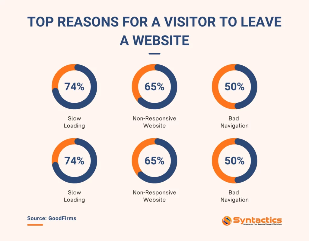
Source: GoodFirms.
Web design leaves lasting impressions on users. Effective designs showcase professionalism, establish credibility, and instill a sense of trustworthiness.
Above all, an appealing website accommodates every potential customer who’s ready to avail of a brand’s products or services.
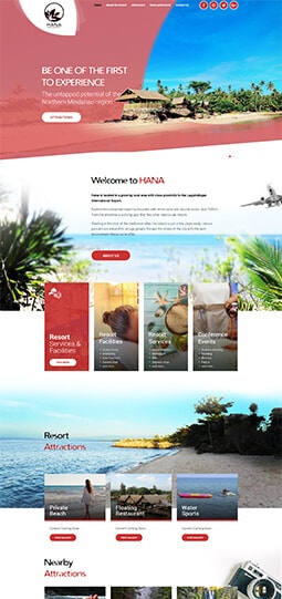
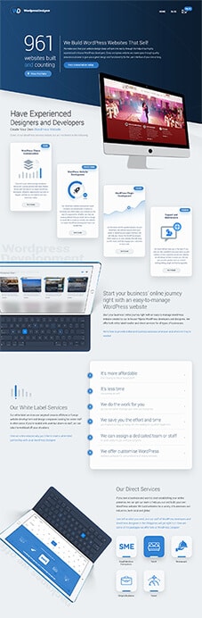
Whether a website is custom-developed or built using WordPress or other website builder platforms, it needs to be attractive, functional, and efficient to stand out in a competitive digital landscape.
How to Make a Website Visually Appealing
Here are five strategies that design specialists use to enhance a website, ensuring that it stands out in a crowded online landscape:
Prioritizing Usability
Consumers know what they want and aren’t afraid to click away if they lose interest. This is why understanding the target audience’s preferences and behaviors is a critical consideration in website design.
Professional designers understand this and make it their goal to empower users to achieve their goals efficiently.
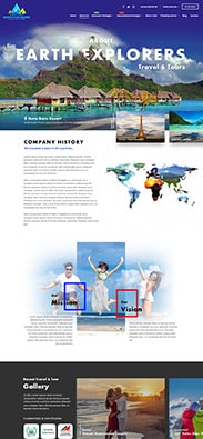
For instance, an eCommerce designer creates online storefronts that organize products into neatly labeled categories. If a website offers services like Search Engine Optimization (SEO), the designer divides them into specific subcategories.
When designing a visually appealing site, it’s important to be as straightforward as possible.
Adding a menu with the most important pages (such as “Home,” “About Us,” “Contact Us,” etc.) in prominent areas contributes to navigability.
Furthermore, designers can ensure that essential elements like contact forms are only one click away to encourage visitors to ask questions. Instead of clicking away from the pages to look for a competitor, prospective customers ask for assistance and begin building rapport with the brand.
Lastly, designers create effective CTA buttons that stand out and encourage conversions.
Staying Consistent
Consistency is key to ensuring a seamless and professional user experience. For instance, communication goes beyond using the same language. Professional websites can leverage users’ reliance on both verbal and non-verbal communication during personal interactions.
For example, designers emphasize CTA buttons by making them a color that’s distinct from the rest of the content.
Thus, it’s crucial to embrace consistency and not stray too far from the norm. One effective way to enhance consistency is by strategically placing logos, images, and visual elements where users naturally expect to see them.
In addition, designers stick to established color schemes instead of completely altering them with every page. They also utilize a set number of text formats for the website’s headings, quotes, and body text to keep the layouts from looking overly cluttered.
In this way, effective web design helps target audiences quickly identify and connect with the organization behind the website. As a result, visitors will have an easier time understanding brand messages.
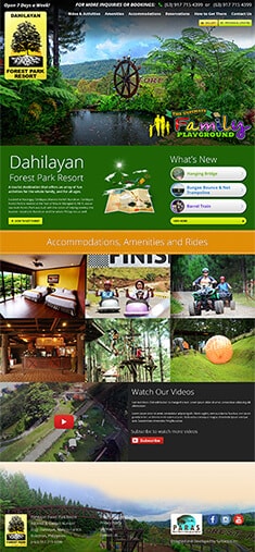
Maximizing the Use of Multimedia
Visual media presents a variety of opportunities to strengthen a brand’s style. It’s crucial to consider the placements of text and graphics to create a cohesive design.
Adding too many images, animations, and videos can make it look cluttered and overwhelming. In addition, excessive multimedia content significantly slows down page loading times, causing user frustration.
A professional WordPress web designer creates visually appealing sites that offer seamless user experiences. They utilize elements like eye-catching images to break apart blocks of text, adding visual excitement and encouraging users to engage with page content.
Designers can also strategically include videos that showcase the benefits of using a brand’s products, along with educational infographics and charts of relevant statistics to provide value and context to the audience.
Quality Assurance (QA) Testing and Iteration
QA testing is essential for creating appealing and functional websites. It’s an ongoing process as a website evolves, ensuring it consistently meets performance and design standards.
Here are some specific examples of testing methodologies that Quality Assurance testers use to ensure the visual appeal of a website:
- Functional testing — checks whether all website features (ex. buttons, forms, and other interactive elements) are working as expected.
- Usability testing — verifies the user-friendliness of the website layout and design.
- Cross-browser testing — ensures that the site looks and functions properly across various browsers like Chrome and Firefox.
- Responsive testing — verifies that the site adapts to different screen sizes and devices.
- Accessibility testing — evaluates whether the website is usable by people with disabilities and complies with accepted accessibility standards.
With the help of QA testers, websites can optimize functionality, enhance user satisfaction, build audience trust, and ultimately improve engagement and conversions.
Get In Touch with Our QA Testers!
Design Practices and Trends to Follow
Web design marches ever forward — especially as we enter 2025, which will continue to introduce design trends and other innovations.
Professional web designers adapt to the following to create compelling online experiences:
Responsive, Mobile-First Design
As the shift towards mobile-first design continues, responsiveness remains a critical focus in web development.
Successful websites intuitively adapt to various screen sizes, ensuring seamless user experiences while navigating and consuming content on mobile.
Performance Optimization
Performance optimization techniques are essential for enhancing user experience and engagement. In addition, improved website performance can contribute significantly to SEO rankings.
The following techniques are vital for enhancing website performance:
- Minimize HTTP requests by combining CSS and JavaScript files to speed up page loading times.
- Compress files to improve site responsiveness.
- Leverage browser caching so that frequently accessed resources are stored locally on user devices, speeding up subsequent visits.
- Utilize Content Delivery Networks (CDNs) to distribute content across multiple servers. This way, the CDN can serve content from the location closest to the user.
- Use code minification to remove unnecessary characters like comments and whitespace from code files to reduce file size and improve load times.
Optimizing for Core Web Vitals
Core Web Vitals measure real user experiences regarding loading performance, interactivity, and visual stability. They include the following:
- Largest Contentful Paint (LCP) — measures a web page’s loading performance.
- First Input Delay (FID) — assesses the page’s interactivity.
- Cumulative Layout Shift (CLS) — evaluates visual stability.
As such, these metrics have a significant impact on visual design.
By focusing on these metrics, web designers ensure that pages load quickly while remaining stable during the rendering process. This results in a seamless UX and improved SEO.
CSS Grid and Flexbox Considerations
Website designers use the CSS Grid and Flexbox layout systems to craft responsive and appealing designs.
Firstly, the Grid layout enables users to create complex designs with rows and columns. It’s ideal for two-dimensional layouts, making it suitable for magazine-style layouts or complex dashboards.
On the other hand, the Flexbox layout simplifies component alignment within containers. It’s best for one-dimensional layouts, so it can be used for designs that require flexible item distribution.
Designers can utilize these two systems to create stunning layouts that captivate and retain users.
Progressive Web App (PWA) Features
PWAs offer enhanced performance and UX, as they’re a blend of the best of web and mobile apps. Examples of Progressive Web App features include:
- Offline Capabilities. PWAs function offline by caching key resources, so users can access content even without Internet connectivity.
- Responsive Design. PWAs seamlessly adapt to various screen sizes, providing a consistent experience no matter the device used.
- App-like Experience. PWAs can be installed on home screens, enabling quick access. This eliminates the need to visit app stores.
By harnessing these features, websites can experience greater user engagement and retention.
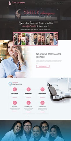
Consistent Color Schemes
Website Color Statistics revealed that color is the most valued visual element on company websites for 39% of consumers.
A brand’s signature colors convey specific emotions and meanings, according to color theory. This is how website owners and web designers determine what color scheme to follow.
It’s become common practice to incorporate logo colors into a website. By doing so, designers can create visual harmony while reinforcing brand identity. Consequently, it’s highly recommended to follow established color theory principles.
Moreover, adding neutral colors, contrary to popular belief, enhances readability and provides a balanced aesthetic, helping to relax viewers’ eyes.
After narrowing down color choices, the next step is deciding on their placement and usage.
According to the 60-30-10 rule in interior design, in a three-color palette, the dominant color takes up 60% of the space. The secondary color occupies 30% of the room to complement it, and the remaining color accentuates the remaining 10%, adding contrast and visual interest.
Accessibility Considerations
Accessibility is a significant consideration in modern web design. Accessible websites implement proper contrast ratios and provide alt text for images, resulting in a website that’s usable by all, including visitors with disabilities.
Adopting inclusive web design practices ensures compliance with global accessibility standards like the Web Content Accessibility Guidelines (WCAG).
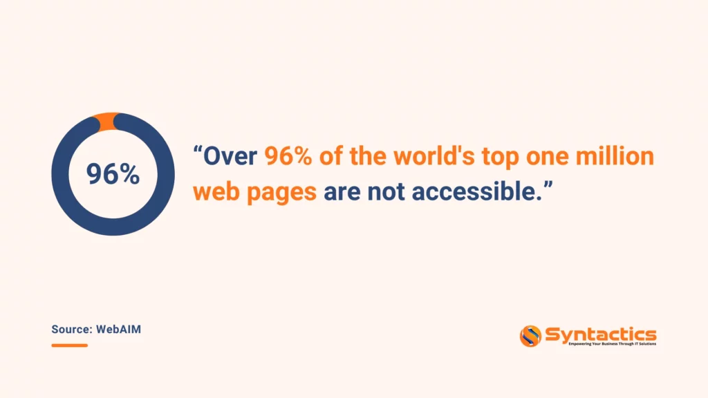
Source: WebAIM.
One way developers can improve a site’s accessibility is by implementing dark mode. It’s a popular and user-friendly design option that changes a site’s color palette to one that reduces eye strain, especially in low-light conditions.
According to EarthWeb.com, as many as 64.6% of users expect websites to automatically apply dark mode.
Here are key considerations for implementing dark mode:
- Color palette. It’s important to choose contrasting yet appealing colors that maintain readability — dark mode often calls for light text on dark backgrounds.
- Toggle functionality. Implementing a toggle that enables users to switch between light and dark modes enhances the user experience.
- Cross-device Testing. QA testers can ensure that dark mode displays correctly across devices and browsers to prevent issues like unreadable text.
Interactive Elements
Leveraging interactive elements, such as micro-interactions and parallax scrolling, contributes to engaging web interfaces that invite user interactions.
These features not only enhance usability but also add a level of delight to a dynamic browsing experience.
Sustainable Web Design
There’s a growing shift toward sustainable web designs and energy-efficient practices. Sustainable websites minimize their environmental impact while retaining their visual appeal.
Here are some best practices designers use to ensure sustainability and contribute positively to the environment:
- Optimize images and multimedia files via compression. It reduces page load times and server requests, resulting in decreased energy consumption.
- Choose eco-friendly web hosting hosting providers that rely on renewable energy sources for their data centers.
- Implement efficient coding practices to speed up loading times, improve performance, and reduce server load and energy usage.
- Create adaptable designs that can evolve over time. This reduces the need for extensive resource consumption.
These reduce the environmental impact of digital content, minimizing energy consumption while maximizing functionality.
Immersive Designs with AR/VR Integration
Integrating Augmented and Virtual Reality technologies into web design creates immersive experiences that appeal to users.
AR integrates with the real world by overlaying virtual 3D images over physical reality. Meanwhile, VR is entirely self-contained and requires computer hardware and headsets to create virtual experiences.
These innovations can significantly transform the way users interact with content. In particular, they’re likely to be prevalent in industries such as eCommerce, gaming, and education.
Here are some key examples of practical VR and AR implementations:
- Virtual showrooms. Retail or eCommerce websites can use Virtual Reality to create immersive showrooms to see how products like clothing, bags, or furniture might look within a 3D environment.
- Interactive product demos. Augmented Reality can be implemented on eCommerce sites to allow customers to experience how products work in real time. For example, a beauty brand can allow users to test makeup via an app.
- Gamified experiences. Developers can utilize AR or VR to incorporate gamification elements within websites to encourage user engagement. Educational platforms can use such simulations to create fun learning experiences for users.
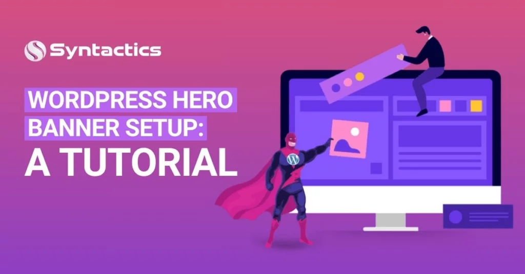
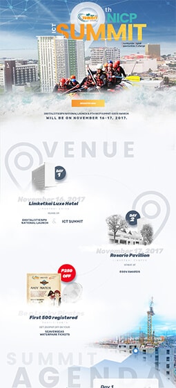
Full-Page Headers or Hero Sections
Full-page headers are an impactful design element that immediately captures attention upon landing on a website.
Also known as hero sections or banners, they often feature images or videos accompanied by copy conveying brand messages or Calls-To-Action (CTAs).
Professional designers can create immersive headers that encourage further exploration of the site.
Learn more about setting up a hero banner on WordPress here:
Conclusion
Visually appealing web designs are essential for leaving impactful first impressions on users and keeping them engaged throughout their visit.
A myriad of design choices and elements work in harmony to reflect a brand’s personality, which contributes to a visually appealing website.
In addition, continuous updates can reflect trends and user needs, enabling brands to stay relevant in an ever-evolving digital landscape.

This blog was updated on January 23, 2025.
Frequently Asked Questions About Website Design
What is web design, and why is it important?
It’s the process of creating the visual and functional aspects of a website, which includes its layout, colors, and User Experience (UX). Web design is crucial for improving user engagement and driving conversions, impacting a brand’s online reputation and success.
What are the 7 steps in web design?
The 7 steps in web design are:
1.) Identify goals
2.) Define the web project’s scope
3) Create the sitemap and wireframes
4) Develop the website’s content
5) Design the site’s visuals
6) Create the website’s code
7) Test and launch
What is web graphic design?
Web graphic design involves creating visual media for websites, including images, logos, and layouts. It focuses on optimizing content for digital platforms while adhering to technical requirements like resolution and loading speed.
About Adam Tan
Adam is a charming geek who loves his family's Siberian Husky, enjoys the occasional night out with friends and, most of all, lives and breathes new trends and updates about the web and its technicalities. If you want to stay updated with changes or new trends on the web or learn about the technicalities that are involved, he's your guy. He's capable of writing cheesy stuff as well, but he'd rather stick with the manly stuff.
- Find more about me on:


Related News:


How to Use Surfer SEO to Optimize Your Blogs

Businesses Succeed with Top-notch Marketing


Comment 0